Feminist Leadership Platform
Motion posters for a participatory programme providing tools for feminist and inclusive practices in arts & culture
UrbanApa
Hullabaloo Children's Studio
Visual identity & Space design for a children's para-learning studio
Copywriting, Marketing and Creative advice: Kripa Kotak. Mural artists: Rajaram & Sachin. Animations by Harsh Tiwari. Voiceover: Anokhi Uppoor. Photography: Aditya Uppoor
Hullabaloo Children's Studio
Reality Research Center
Annual report for a community centre for performance art and research
Todellisuuden Tutkimuskeskus
Frame Contemporary Art Finland
Communication strategy, digital marketing and graphic design for a cultural institution and advocate for Finnish contemporary art.
Communication Team: Laura Boxberg, Rosa Kuosmanen, Laura Jurmu, Stella Sironen. Visual identity: Marina Veziko
Frame Contemporary Art Finland


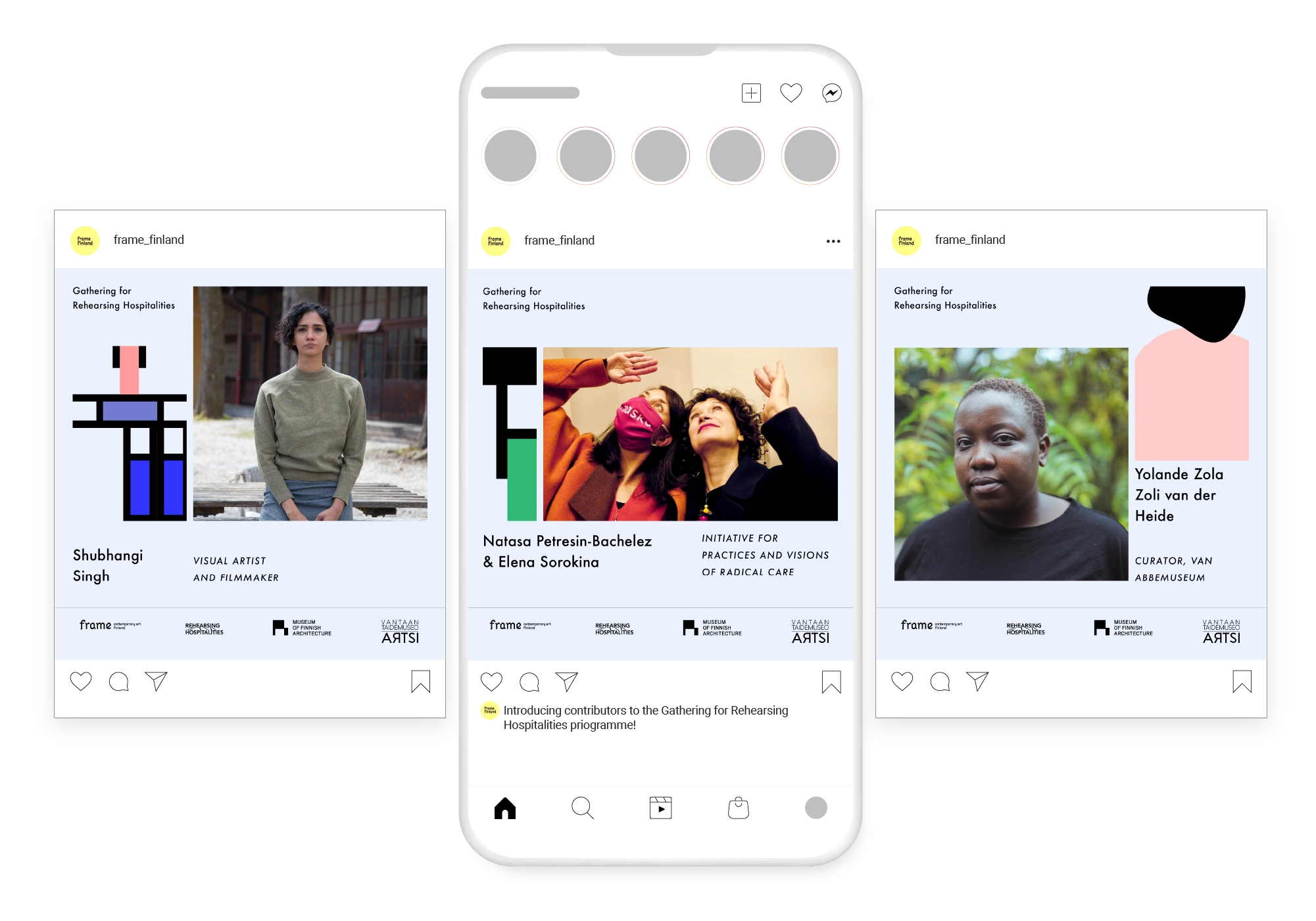
Rehearsing Hospitalities
Communication design, strategy and event production for a contemporary art public programme
Visual Identity by Elina Holey | Comms: Laura Boxberg, Rosa Kuosmanen, Laura Jurmu, Stella Sironen | Curation & Production: Jussi Koitela, Yvonne Billimore , Dahlia El Broul, Lebohang Tlali, Mariliis Rebane, Annabelle Antas, Vilma Leminen | Photos by Sheung Yiu, Jo Hislop, Jonni Korhonen | Production Design at UniArts by Marja Zilcher
Frame Contemporary Art Finland
Consent of the Governed: Strictures, Constitution & Kink
Publication design for a series of essay anthologies
Curated & Edited by: Vidisha-Fadescha and Shaunak Mahbubani | Contributors: Tiona Nekkia McClodden, Dhrubo Jyoti, Latoya Aroha Rule, MF Akynos, Jyotsna Siddharth, Khaleb Brooks, and Kinkinella
Party Office & After Party Collective
Core
Ethnographic research reports for Core, which focused on co-creation of new services for women’s Sexual and Reproductive Health in India, Kenya, Nigeria, and Tanzania.
Design & Research team: Priyam Sharda, Shalini Subbiah, Jennifer Helfer Paavola, Rashmi Jagdish, Jarkko Kurronen, Laura Seppälä
Scope Impact OY
Momemtum Magic
Spatial illustration for an educational exhibit at a children's museum
Playseum
#Stop Hatred Now
Visual identity for an anti-racist art programme
Facilitator: Sonya Lindfors | Producer: Lisa Kalkowski | Communications: Milla Millasnoore
UrbanApa
UrbanApa X Ateneum: In the Deep / On the Surface
Visual Identity & publication for a Contemporary Performance Festival
Curated by Emmi Venna and Sonya Lindfors.
UrbanApa at Ateneum Museum
Moon in your Mouth
Mini-campaign for a contemporary art exhibition and parallel summer school
Contributors: Thora Dolven Balke, Tarek Lakhrissi and Inari Sandell. Curators: Max Hannus , Jussi Koitel, Yvonne Billimore. Communications: Rosa Kuosmanen, Stella Sironen
Young Artists' Society / Frame Contemporary Art Finland
Islands of Kinship
Communication design for the annual gathering of a pan-European network of art organisations
Visual Identity by Von Saten
Frame Contemporary Art Finland
Conflicting Relations
A hybrid visual identity for a day-long public talks programme at The New School.
Comms: Rosa Kuosmanen, Stella Sironen. Curators: Jussi Koitela, Yvonne Billimore, Eriola Pira, Carin Kuoni. Contributors: Matti Aikio, Emily Johnson, Elina Waage Mikalsen, Wanda Nanibush, S.J Norman, Ali Rosa-Salas, Ana Beatriz Sepúlveda, Karoline Trollvik
Vera List Centre at the New School
Editorial Tables: Reciprocal Hospitalities
Poster and communications material for an exhibition showcasing diverse publishing practices
Curators: Yvonne Billimore, Lily Hall, Jussi Koitela. Gallery image: Daniel Weill
Frame Contemporary Art Finland, The Showroom, and the Finnish Institute in the UK and Ireland
UA mini residencies
Visual identity & communication design for short artists’ residencies in Finland.
Urban APA
i must alter myself into a life form which can exist on this planet
Cookie dough typography for poster series for a contemporary art exhibition by Laura Rämö
Stills provided by Laura Rämö
Melodious Composites
Illustrated wedding box
Konvolv
Visual identity for a new media art cooperative
Konvol New Media Art Collective
Breaking through the sugar glass
Flux Island
Comms for Aalto Medialab exhibition at Vuosaari, Helsinki
City of Helsinki
Strategy workshops with LEGO® Serious Play®
Visual identity for a collective of workshop facilitators working with LEGO® Serious Play®
PlaymyStratefy OY
Infragraphy Vol 2
Student publication / Essay / Contemporary art / Circuit bending / Inequality
Editor_Samir Bhowmik | Authors_Gurden Batra, Ameya Chikramane, Punit Hiremath, Eerika Jalasaho, Reishabh Kailey, Leo Kosola, Kevan Murtagh, Surabhi Nadig, Takayuki Nakashima, Julia Sand, Liisi Soroush, Hanna Thenor Årström
Aalto Medialab
UD 2020
Event identity for Fifth International Conference on Universal Design
Aalto Department of Architecture
Meru health
Brochures for a Mental health start-up
Meru Health OY
When light echoes
New media exhibition at Seoul School of Integrated Sciences and Technologies
Reishabh Kailey, Punit Hiremath, Sanni Honkanen, Olli Ketonen, Hanna Thenór Åstrom, Thu Nguyen, John Lee
Seoul School of Integrated Sciences and Technologies, Aalto Medialab
DVNGRI
Typeface design in Devanagari, a script used by many south-asian languages
glyphdrawingclub
Experience Colours
Event identity for a colour conference
Aalto Experience Platform
Talk kallio
Event identity for a series of public conversations
Miklagård Arts OY
Crackle & burn
Identity and packaging for an artisinal candle brand
Photography_Aditya Uppoor. Candles designed by Veena Uppoor
Crackle and Burn
FITech: Visualising teaching material
Advance Business Management – A collaboration between six Finnish universities
Tampere University, Åbo Akademi University, Aalto University, University of Oulu
VR Hub
Poster for a space dedicated to learning about extended reality experiences
VR Hub Director_Eero Tianien \ Original artwork by_M.C. Escher
Aalto University
DADA christmas party
Party Poster with illustrated typography
DADA, New Media Students' Union
Pop the bubble
Speculative campaign about filter bubbles
Aalto University
Culinary Posters: Taj Mahal Palace Mumbai
Posters for fine-dining venues at the hotel
Guidance_Ajay shah
Taj Mahal Palace Hotel \ ASDS Mumbai
Bananarama Display
An elegant grotesque inspired by the humble banana
Type design guidance: Professor Mahendra Patel
Shamiana at Taj Mumbai
Brand refresh for a restaurant
Creative support_Ajay Shah | Copyrighting_Mikhail Vaishnav
Taj Mahal Palace Hotel \ ASDS Mumbai
Cobault
Visual Identity for a cafe concept
ASDS
Epsilon
Campaign for condominiums
Creative direction_Ajay shah \ Design team_Aparna Kale, Sadhna Prasad
Shapoorji Pallonji Group \ ASDS Mumbai
Drishyam films
Visual identity for a film production company
Drishyam films
Masaan / Fly Away Solo
Digital promotional campaign for a drama film, winner of the FIPRESCI & Un Certain Regard awards at the 68th Cannes Film Festival
Film director: Neeraj Ghaywan \ Film writer: Varun Grover \ Marketing strategy: Jahan Singh Bakshi
Drishyam Films
Waiting
Film deck and poster
Drishyam Films
Om Dar-B-Dar
Film poster for the remastered avant-garde cult classic directed by Kamal Swaroop
Drawing by Punit Hiremath
PVR Director's Rare
Apsara Pencils
Packaging design for pencils
Hindustan Pencils HPL
Lola by Suman B
Identity for a fashion label
Lola
Swarathma - the Inside Story
Band biography / coffee-table book
Photography_Sruti Menon & Shriparna Sarkar
Graduation project
Fidèle
Packaging design for dog food
Fidèle Dog Food
